form is void – void is color
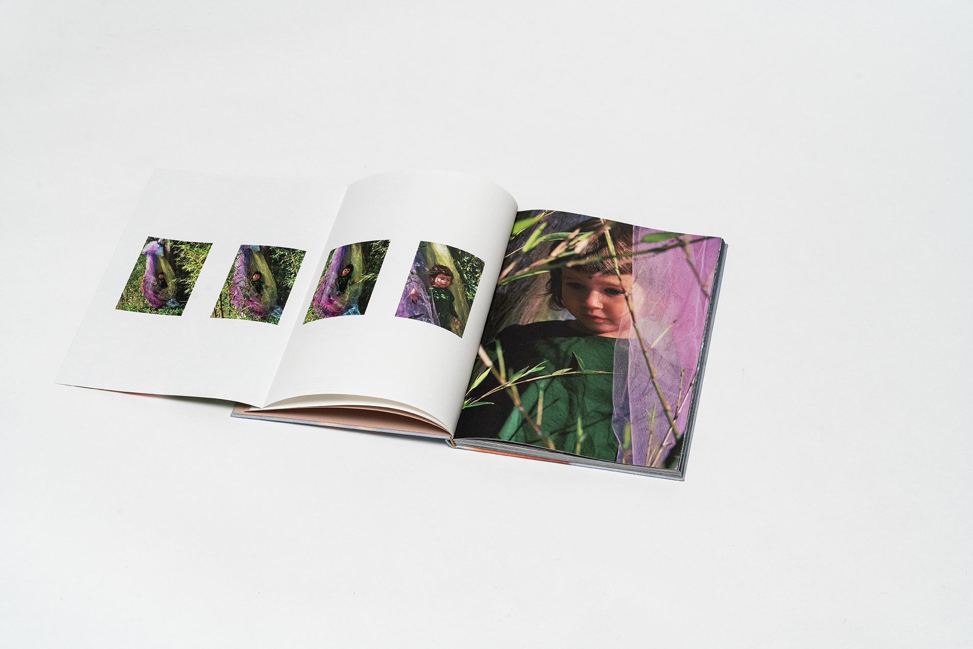
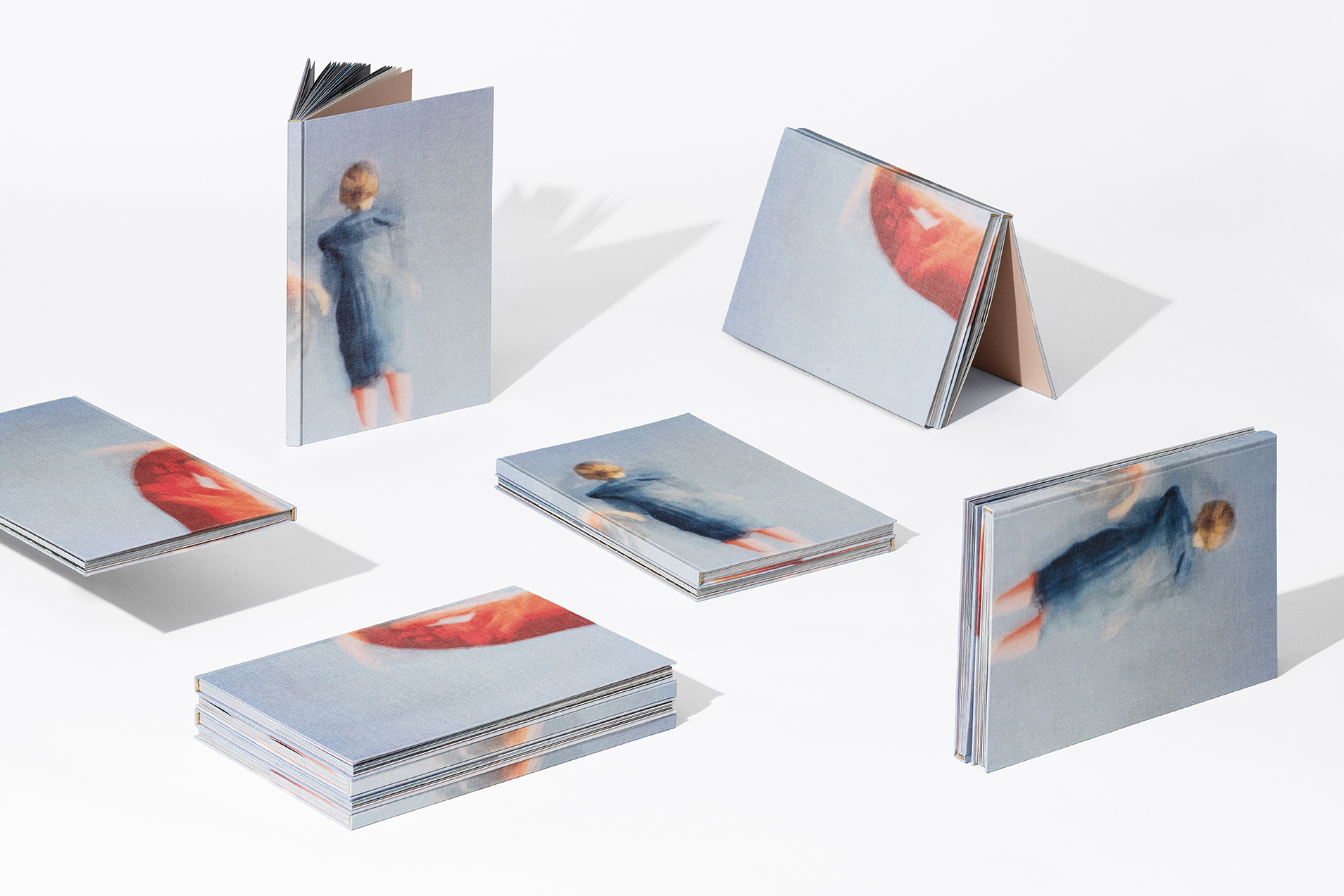 Our visual evolution begins in our childhood. We cannot say exactly when it starts – could it be our first travel? – but we do know it is developed throughout our constant discovery of the world and of our place in it. Gayarama Studio & Joel Valabrega’s form is void void is color aims at recapturing this inner visual-narrative activity: dealing with transformation, form and landscape, this labyrinthic book – defined by elaborate paper engineering – reflects the imaginary content where the observer metaphysically follows a phantasmagorical children journey.
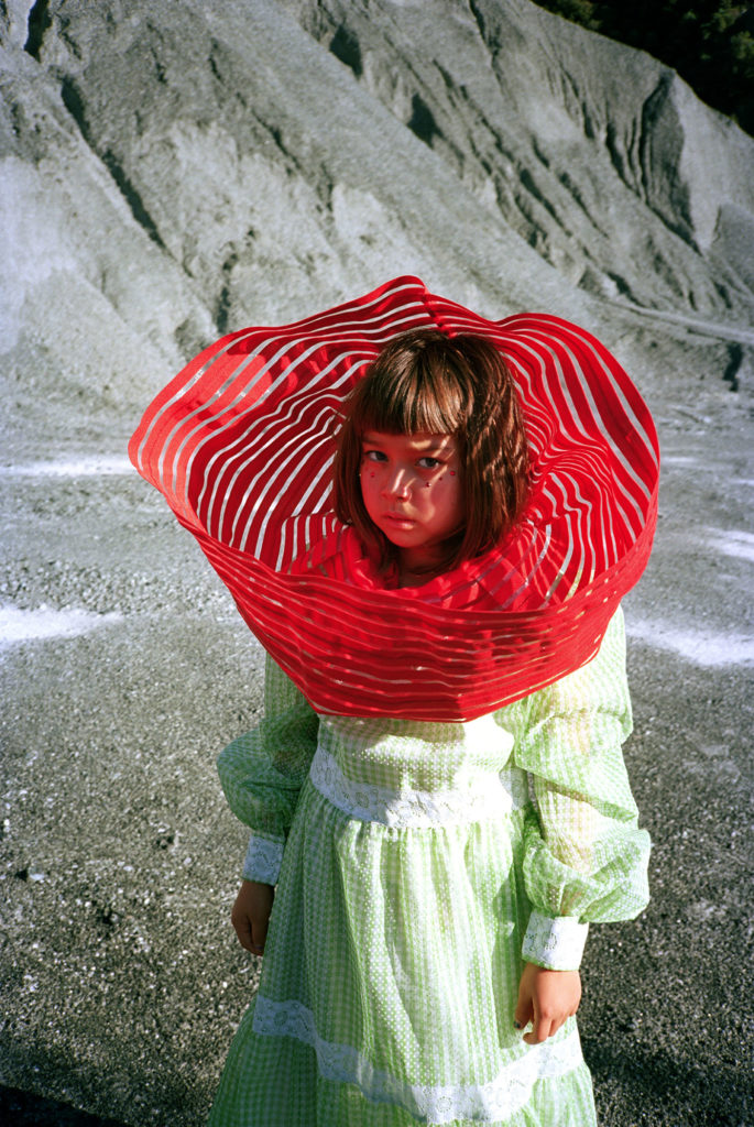
Three little girls, Uma, Dolma and Aiko, are the protagonists of the story. Moving across spaces through a constant and coloured metamorphosis, their adventures generate reciprocity, both as individuals and as parts of a community. A real sisterhood, which manages to mingle with our imagination as readers and tells us about natural elements: water, fire, air, earth and space acquire new identities according to the characters’ change of perspective. The story is marked by both twists and stasis, sudden action and reflection on the landscape.
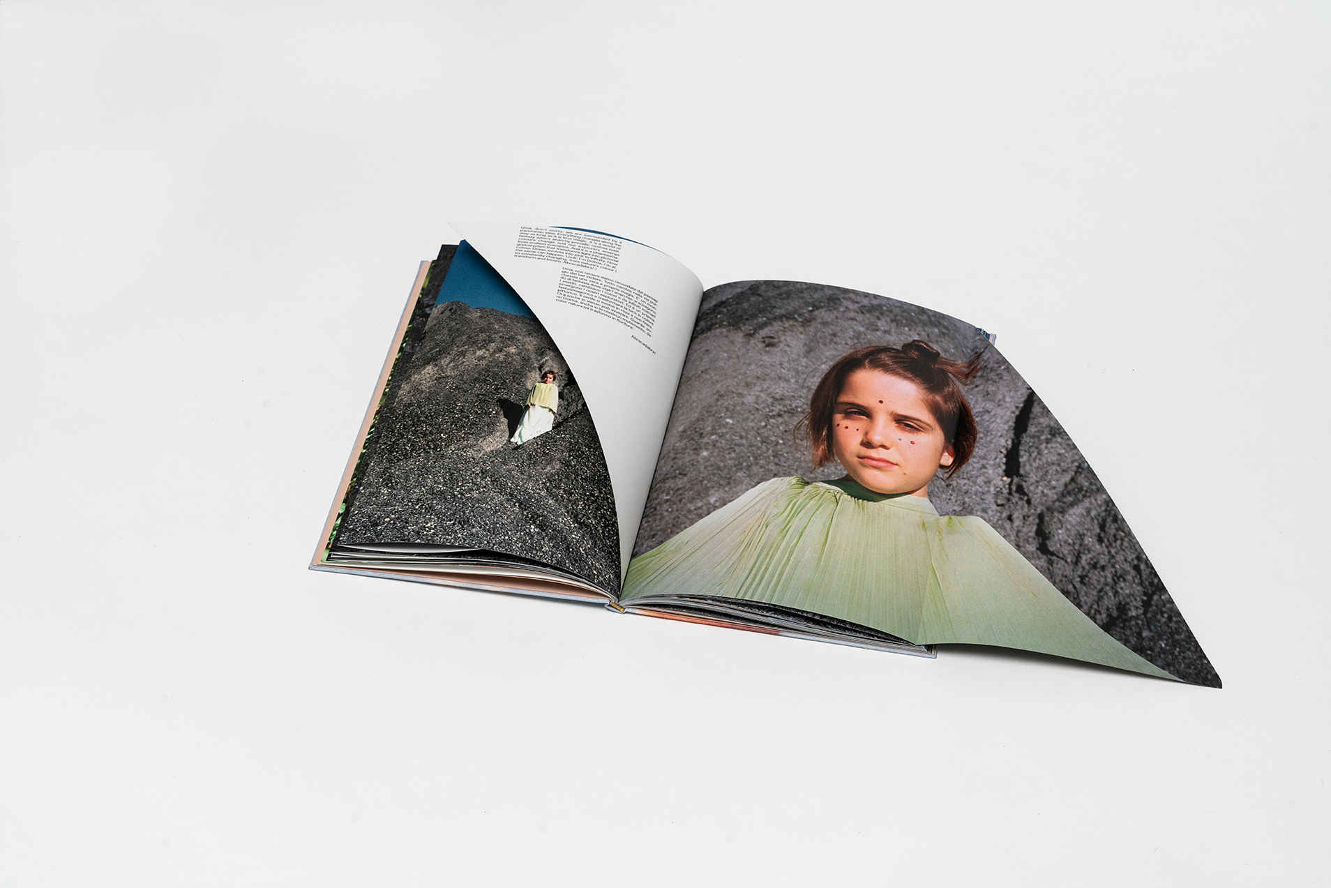 However, there is more to the book than just Uma, Dolma and Aiko’s adventures: page after page, the architecture of the book itself draws the reader into hidden images, pure colours and texts (in Italian and in English), into an actual paper labyrinth, designed as a multi-layered, ceaseless exploration. form is void void is color is a fairy tale, a photo book, a fashion moodboard, an art book.
I read the book with one of the protagonists, during a rainy afternoon in London. Watching Uma by my side, I understood that she was recognizing herself in those pages and moving onto a different time level: could this teach her how to dream, make plans and preserve her memories? I think so. I wish I’d done the same – I especially wish my parents had done the same.
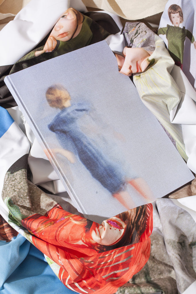
 In fact, form is void void is color is a project based on real life events. The work began in Pomaia Santa Luce, with an adventurous 3 days photo session. Near Smolenskaya, in Moscow, images then turned into an object book which was then printed in the Milanese suburbs. Simultaneously, in London the artists have re-elaborated the images as an installation of a gigantic book printed and embroidered on textile. Made over a 3 year period from 2017-2020, form is void void is color is a living collaboration between Gayarama’s photographic eyes and the research of the curator Joel Valabrega.
Inside the book, the children don’t run from nature – they embrace it. I think of the children of the future, and I break into a smile: I hope this will be part of their schoolbooks, something to learn – or dream – by heart. There is no reason why this should not happen: growing up, social dynamics have made us lose part of that confidence in discovering and observing we all had when we were Uma’s age.
 Still, as children, we frowned upon those who couldn’t make time for their passions: the thought that our universe was on the same timeline as the world of adults didn’t even cross our minds. So, our first piece of advice while reading form is void void is color is to let yourself go and indulge freely in the rediscovery of our infinite history: images, sounds, sensations. At the same time, this book can stimulate children’s imagination and help them first approach and organize their visual and creative world. In terms of typesetting, the stylistic mark emphasizes the relationship between form and void through black blocks of bilingual text which are defined within the whiteness of pages.
Back to imagination: as claimed by Joel Valabrega, we need to rethink and reshape art education for today’s children, for they will be the designers, artists and collectors of tomorrow. However, I feel there is more to it. According to the principle – which all school systems should follow – that the evolution of imagination is the same everywhere, form is void void is color can be seen as a unique experiment in art education: there is no distinction between young and adult readers. The ultimate goal is to find a new visual sisterhood, as an eclettic manifesto.
 Main references: Bruno Munari and his research on polysensoriality and the development of creativity in children. From an editorial perspective, the search for cultured and aesthetically designed beauty and the architectural mise en page reminds us of Franca Sozzani’s work at Vogue Bambino. On a literary level, the timeline recalls Flatland, Abbot’s two-dimensional world: flat, but not superficial, much like our childhood memories.
While congratulating Gayarama Studio, I hope they continue to investigate our feelings and sensations, and to work for a better, more colorful world. I would like to thank Joel Valabrega, the curator, for carefully finding and maintaining a line of continuity in this narrative project, and managing to keep it away from the banality and vapidity which are so often part of works dealing with childhood.
 Finally, I’d like to address future parents, and the people who will live and handle our visual culture in the years to come. I hope we will all take the same measures while approaching the issue of reciprocity, in order to envision the imagination of tomorrow together. If we succeed in keep our infinite story in mind, if we are able to take a look of the skepticism in the world and overturn it with the same faith and imagination we had as children, only then will we be able to say we have read and fully understood form is void void is color.
As soon as the book was born, the authors asked to the singer Jonathan Clancy – His Clancyness – to read and record the story and to photographers Ronni Campana and Delfino Sisto Legnano to reinterpret it through artist still life.